Rebuilding boAt's fitness app from a cluttered tracker into a calm, guided companion people actually wanted to open.
Overview
Product
boAt Crest, the companion app for boAt's smartwatches and fitness wearables.
Problem
A cluttered, one size fits all interface that users found hard to navigate and easy to abandon.
Details
Sole product designer across research, experience, and interface, on Android and iOS.
Solution
A decluttered, personalised app with guided onboarding, customisable watch faces, social challenges, and a unified design system.
Result
The app store rating climbed from 2.3 to 4.
Impact
4.0
App store rating, up from 2.3 after the redesign
100
Users surveyed to ground every decision
90%
Had been dissatisfied with the old interface
Context
boAt is one of India's best known consumer electronics brands, built on affordable, stylish audio gear and a fast growing line of smartwatches. boAt Crest is the companion app that pairs with those watches to track fitness, health, and daily activity.
By the time this redesign began, the app had fallen behind the hardware. The watches were selling well, but the app meant to bring them to life felt cluttered and dated, and the store rating reflected it. My job was to make the app worthy of the watch on the wrist.
Problem
The app that should have made boAt's watches shine was the weakest part of the experience. Navigation was confusing, the tracking gave people little they could act on, and nothing adapted to the person using it. Most tried it once and drifted away.
Goals
An app boAt users actually want to open, one that feels calm, personal, and worth coming back to.
- 01
Declutter the interface so the core actions are obvious
- 02
Personalise the experience around each user's own fitness goals
- 03
Replace generic flows with guided onboarding and guided workouts
- 04
Build motivation through social challenges and shared progress
- 05
Establish a unified design system for a consistent, polished feel
Process
Discover
Stakeholder and user interviews, a survey of 100 users, and a competitive teardown of the leading fitness apps.
Define
A primary persona, an empathy map, and a user journey map to anchor every decision in a real person.
Develop
Information architecture, a design system, and high fidelity screens for onboarding, tracking, watch faces, and social.
Deliver
Split testing the new flows against the old, then design handoff and support through development.
Key insights
01
75 percent of people surveyed used a fitness app regularly, so the demand was real and the old experience was simply not meeting it.
02
90 percent were dissatisfied with the old interface, which told me the problem was the experience, not the hardware.
03
85 percent wanted guided workouts over generic exercises, and that became the backbone of the new flows.
Solution
boAt Crest, rebuilt as a calm, guided fitness companion that adapts to the person wearing the watch.
Design
Guided onboarding
A layered onboarding that pairs the watch and sets goals one step at a time, instead of dropping people into a crowded home screen.
Design
Streamlined navigation
A simplified navigation bar that keeps Fitness, Watch, and Buddies one tap away, clearing the clutter that used to drive people off.
Design
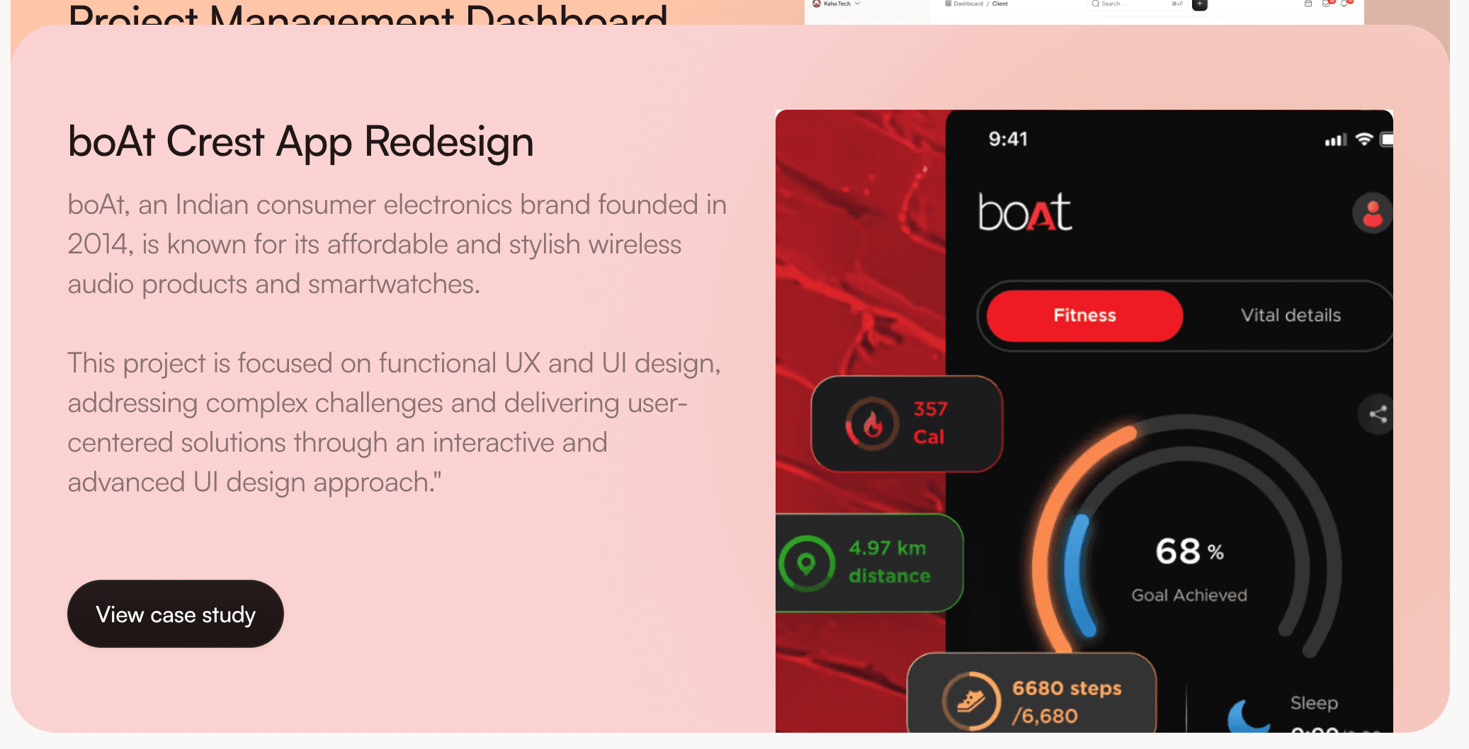
Real time insights
Tracking that surfaces clear, glanceable insight on heart rate, energy, sleep, and stress, so the numbers finally mean something.
Design
Watchface Studio
A studio for browsing and customising watch faces, turning a buried setting into a reason to open the app.
Design
My Buddies
Social challenges and shared progress that turn solo tracking into something motivating.
A selection of screens across fitness tracking, watch management, and social.
Before and after
Before
After
The old interface beside the redesign, the same data made calm and legible.
Every screen had to earn its place. If it did not help someone move, sleep, or recover better, it did not belong.
Reflection
This redesign taught me that the hardest part of a consumer app is restraint. The pull was always toward adding features, but the real wins came from removing friction and giving people one clear path through.
If I were taking it further, I would close the loop with longer term data on whether the guided routines actually improved adherence over months, not just satisfaction in testing. Strong test results are a start, but lasting behaviour change is the real measure.
boAt's watches finally had an app worth wearing them for.